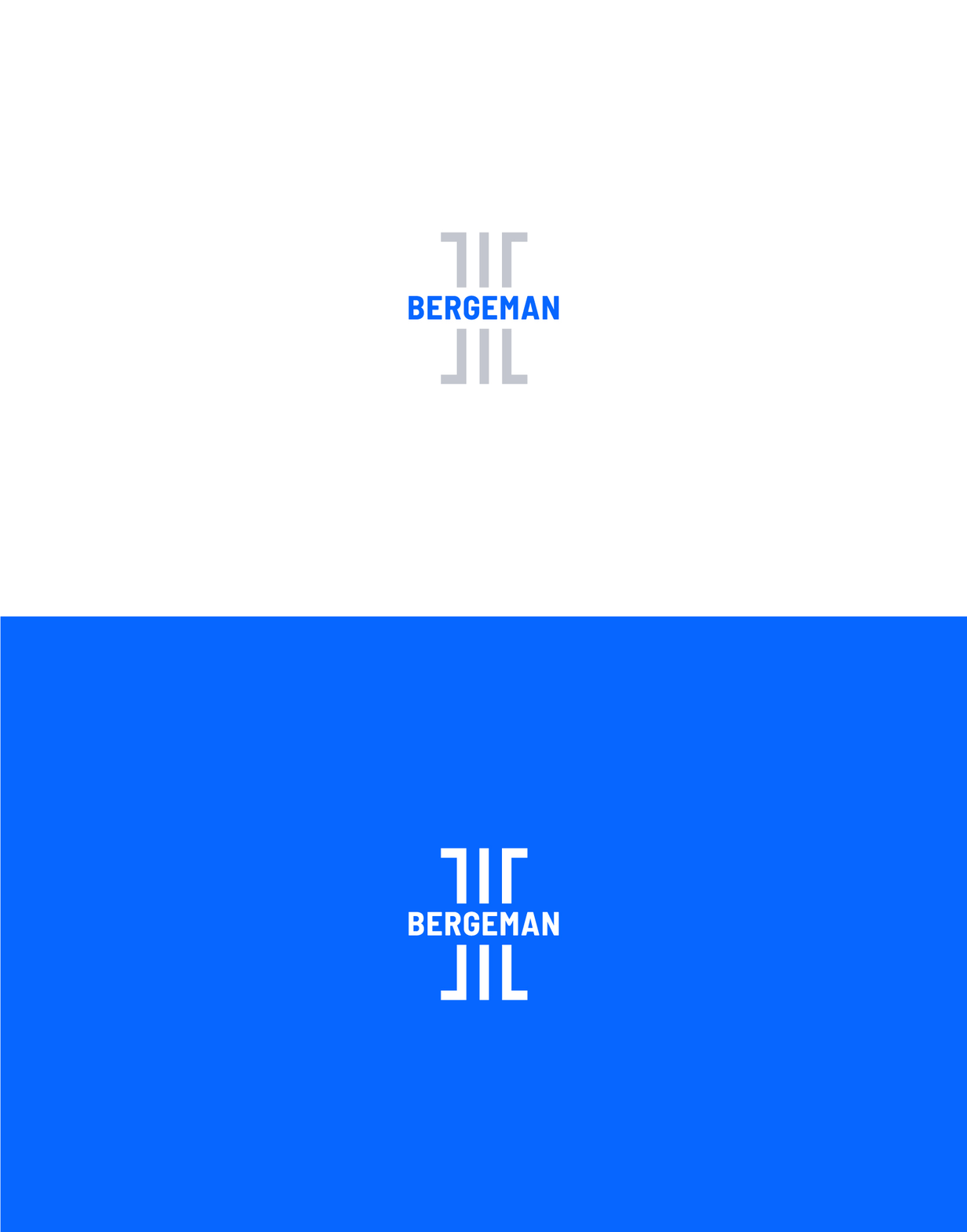
BERGEMAN
2020
SCROLL

CLIENT: BERGEMAN LAW
INDUSTRY: LEGAL SERVICES
PROJECT: IDENTITY DESIGN
Elevating a premier injury law firm with a storied record of success.
APPROACH
As a respected law firm in the LA market, Bergeman needed to stand out with an elevated contemporary identity. The team pushed for a bold yet minimal look to be better in line with that of a top tier legal firm.
RESULT
The new logo incorporates an abstract column design that reflects strength, support and connects the mark to the legal services industry. The bold sans-serif typeface instills pride in the Bergeman name and legacy of the firm.
Bold and thin typography creates dynamic contrast and pairs nicely with a single primary color. This energized blue commands attention and conveys Bergeman as a trustworthy partner.


